Over on lobste.rs I saw that Alex (aka matklad) posted his great post, Against Horizontal Scroll. I just fought this on my site rewrite so here are some tips I can add.
Viewport Units (e.g. vw)
Be careful when using vh/vw, including
their svh/svw counterparts1. These units do not account for scrollbars, so a simple
body { width: 100vw } will result in a body that is
wider than the viewport as soon as your content is tall enough
to have a vertical scrollbar.
Speaking of scrollbars: test on devices with scrollbars turned on or you might miss horizontal scrolling caused by the existence of a vertical scrollbar. And you might miss nested vertical scrollbars. If you develop on a MacBook with a trackpad, for example, you do not have scrollbars enabled:
If you use body { min-height: 100vh; }, e.g. if you
have a footer and always want it pushed to the bottom of your
grid layout, you need to account for margin-collapse between the
body and its first child or last child. If the first child has
top margin or the last child has bottom margin, your body will
be >100vh. You can either:
- make sure the children don’t have top/bottom margin
-
add
body { padding-block: 0.05px; }, since padding stops this margin-collapse -
make your body a
flexorgridcontainer, which also stops margin collapse
Box sizing
Wherever you use padding/border either account for it in your
width calculations or use box-sizing: border-box to
let css figure it out for you. This doesn’t handle margin
though. More details over at
CSS-Tricks, of course.
Unconstrained Markdown Content
If you generate your content from markdown and aren’t always setting widths on everything as a result, make sure you handle that. I would:
-
Set a max width on media, either globally or constrained to your markdown-generated content:
global.css img,svg,video {max-width: 100%;height: auto;} -
Wrap
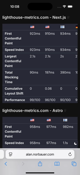
<table>s in a wrapping div, and constrain the wrapping div. It’s trivial to do this with a Rehype plugin, e.g. on this site I configured Astro to userehype-wrap-all:astro.config.ts import rehypeWrap from "rehype-wrap-all";export default defineConfig({// ...markdown: {// ...rehypePlugins: [// ...[rehypeWrap,{selector: "table",wrapper: "div.markdown-table-wrapper",},],],},});And I constrained
.markdown-table-wrapperlike so:global.css .markdown-table-wrapper {max-width: 100%;overflow-x: auto;}Which looks like this:
Grid
Grid layouts can be super simple ways of skipping a lot of math.
For example, you can make a 2-column grid (grid-template-columns: 1fr 1fr) and then give it any gap you want, and the columns will just
fill in the remaining space. If you used block items with
margins, you (might) have to keep track of the margin when
figuring out your max width. Using grid will make it easier to
stay in bounds by default.
End-to-End Testing
Lastly, if you’re really silly, you can add Playwright testing into the mix. Just add a bunch of devices into the test matrix2, visit various places in your site, and, using a custom matcher, assert the page doesn’t have a horizontal scrollbar, e.g.:
import { test, expect } from "../fixtures/fixtures.js";
test.describe("homepage", () => { test("has no scrollbars", async ({ page }) => { await page.goto("/"); await expect(page.locator("html")).not.toHaveHorizontalScrollbar(); });});EDIT: While writing this article I tweaked a style that I thought was totally harmless and it caused horizontal scroll on exactly one page on my whole site, and my tests caught it. Maybe testing this isn’t so silly.
Footnotes
-
More details at The Large, Small, and Dynamic Viewports ↩
-
The narrowest devices in Playwright’s device catalog are 320px wide, so use either “iPhone SE” or “Galaxy S9+” in your config. Ideally you’d have a device for each of the upper and lower bounds of all your media queries but I just yolo’d it and you can copy me. ↩